Lift chart
A lift chart is used to evaluate the performance of a classification model.
NOTE
A classification model, is simply a model which is used to predict a discrete variable.
An example lift chart is shown below.
A lift chart in Bayes Server can be used to evaluate the effectiveness of a model when predicting (classifying) a particular discrete state (e.g. Purchased=True). Consider the example of targeted marketing, where the purpose of your model is to select customers who are most likely to purchase your product. By ranking the predicted probability of a purchase, a chart can be generated that shows the effect of selecting cases with the highest probability first, as these are the cases that marketing would select based on the advice of your model. If the expected value for a case was indeed a purchase, then the chart will increase on the y axis (% of total purchases).
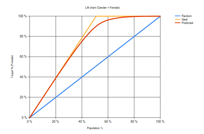
Three lines are displayed on the lift chart. Predicted, Ideal, and Random.
- Predicted - displays the results for your model.
- Ideal - displays the ideal scenario (no classification errors)
- Random - displays the results based on a theoretical model which randomly selects cases.
By examining the chart, you can evaluate the performance of your model. In the targeted marketing scenario, you can also determine what percentage of cases should be chosen for marketing.
A lift chart can be generated from the Statistics tab in the Batch Query window. Both the expected value, and the predicted probability of a particular state are required.
The predicted probability of a state can be output using a PredicProbability query, e.g. PredictProbability(Purchased=True).
The expected value, can be included in the output, via an Information Column, defined in the Data map window.
NOTE
An alternative way of accessing the expected value, is to map the predicted variable in the Data map window, and use retracted evidence so that the prediction does not use the expected value.
Score
The score is a positive or negative probability between 0 and 1 indicating the classification performance of the network.
NOTE
Score = (area under predicted - area under random) / (area under ideal - area under random)
A score of 0 indicates that the predictive performance is no better than random.
A score of 1 indicates the network perfectly predicts all cases.
A negative score indicates the network performs worse than random, which may indicate incorrect usage.
Calculations
The lift chart is calculated as follows.
- For each prediction of the target variable
V, we output the probability of the modal predictionP(V[modal])in addition to the standard modal prediction.
NOTE
The modal prediction is simply the state of V that has the largest probability given the evidence.
We then sort all the predictions by
P(V[modal])descending. i.e. we start with predictions we are most confident about.To draw the lift chart line, we start at the origin, and then for each prediction we:
- Move 1 unit along the x axis
- If the prediction is correct we move 1 unit up the y axis, else we stay at the current y axis level
NOTE
To draw the ideal line we perform the same steps as above, but assume all predictions are correct.
To draw the random line we perform the same steps as above, but assume all predictions are 'random', which means we assume the modal state of V given no evidence.